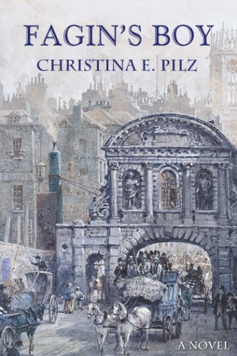
As I recently posted, Fagin’s Boy got an overhaul, courtesy of my editor doing her editorial magic, and me with my butt in the chair doing my writerly best with the revisions. Writing is hard work, and while it can be difficult at times, it’s usually fun. Revising has always been fun for me, but this time around, it was a little more nerve-wracking, as I wanted my writing to be worthy of the new cover I was getting.
My previous cover was lovely; Jenny at Historical Editorial did a great job with the ideas I gave her. The result was indeed close to my heart, with all those cool blues, and the wintery street scene, and the font that I wanted.

But while I adored the old-fashioned look of it, I’m not everybody, and I felt that the cover needed to be able to work in a series. Not being a cover designer or graphic artist, I needed to find someone who could.
I went to Joel Friedlander’s ebook cover contest and reviewed the covers for several years to see whose name came up the most often and what the feedback was. There were lots of folks with lots of talent, and pretty soon, my eyeballs couldn’t see the forest for the trees, but I had my list. Then I took that list, and went to each designer’s website, to look at their portfolio, to see their prices and services.
Out of that, I picked Bookfly Design, because they fit all of my criteria: beautiful covers, the presence of historical fiction covers, and covers that would make me want to read the book. Plus,when I wrote to ask them a question about doing covers for a series, their response was swift and positive: “We can do that.” I got lucky there too, as James T. Egan got the “e-Book Cover Design Award Winner for December 2014 in Fiction” on Joel Friedlander’s site.
After I gave Bookfly Design my manuscript and my ideas, James’ cover idea was perfect right out of the box. I’m not kidding. I asked him to tweak this and that, but after doing that for about two minutes, I asked him to use the original, which he did. When he sent me the final version, I was so pleased, I did a little jig in my jammies.
Here it is. Ta da!

And here’s a really huge version of it, so you can see all the lovely details.

On the left, you see, are books. This represents the underlying theme (or one of them), which is Oliver’s love of books and his dream of one day owning a bookstore. On the right is an image that represents London: the foul weather, the traffic, the effect of the fog on the streetlights. The font is touched with romanticism, and the title of the book is in red, to match the books on the left, and also to add to the sense of romance.
The painting on the right is by a gentleman named John Atkinson Grimshaw, and would you believe that I had stared at his paintings for over two years before I contacted Bookfly Design? Yes, I had, but I while I adored the atmosphere in them, I couldn’t figure out how to use them in a cover. Like I said, I’m not a graphic designer, but thank goodness James is. We’ve agreed to use the same layout in all the books in the series, with the element on the left, and one of Grimshaw’s paintings on the right, and I’m looking forward to it.
Would you believe that a cover like this makes me want to write more?
What a fabulous new cover!!! The texture is amazing. And yes, I know what you mean about a cover making you want to write more. It’s inspiring to see an artist wrap up your work with such finesse.
Hey, thank you! Yes, Boofkly Design did a terrific job, and I couldn’t be happier with the result. I just look at the new cover and I can feel the inspiration oozing out at me.
Oh! It’s breathtaking!
Thank you very much!
Thanks for this post! I’ve been agonizing over the awful cover on my second book and the overall look of the series but not actually doing anything about it. I was so impressed with the new cover on Fagin’s Boy that I checked out Bookfly Design and, based on their portfolio, this post, and the author testimonials, I made a decision. I’m going to take a deep breath (hadn’t intended to spend this money yet) and redo both covers and come up with a better overall series brand as soon as they can fit me in.
You are more than welcome. And I know what you mean about taking the plunge and spending that kind of money and time. Bookfly Design’s prices are at the top end of the middle, but I think they are worth it because for my book they had ideas that I’d not even thought of. And you know, right, that I thought long and hard about how pretty my cover would look if I did this or that? But I’d not even come close to imagining anything like what he came up with. Like, the curly red font? Never would have considered it, not in a million years.
Good luck with your new covers!